Overview
A multi-year revamp of the Verizon Cloud backup and storage product, modernizing both the Android and iOS apps. What started as a planned UI refresh grew into a deeper rebuild of the app's architecture and experience.

Problem
Verizon wanted Cloud to become a leading, cross-platform digital backup and storage product, but the existing app's architecture and design were limiting how fast the team could ship improvements, and the experience itself needed to feel more modern and intuitive.
Role and Responsibilities
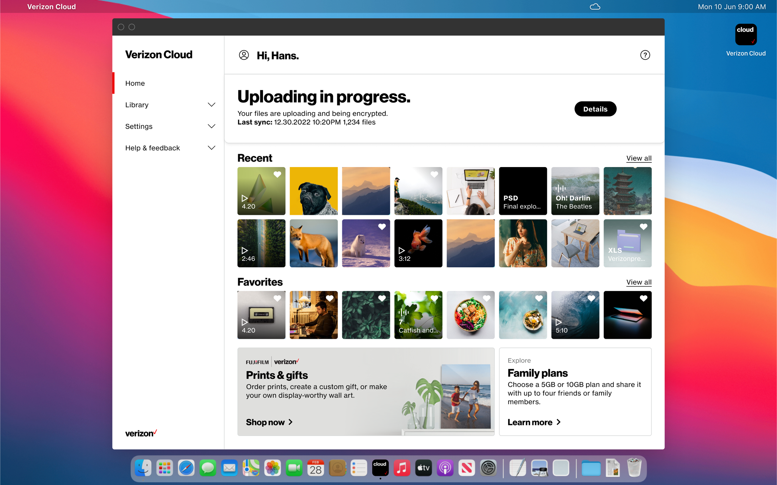
I was UX/UI Lead on this project, working closely with Geoff Mosher (Product Lead) to translate the new architecture and product strategy into a componentized, cross-platform interface — covering navigation, content structure, and the redesigned Library and subscription/plans experiences across iOS and Android.
Solution
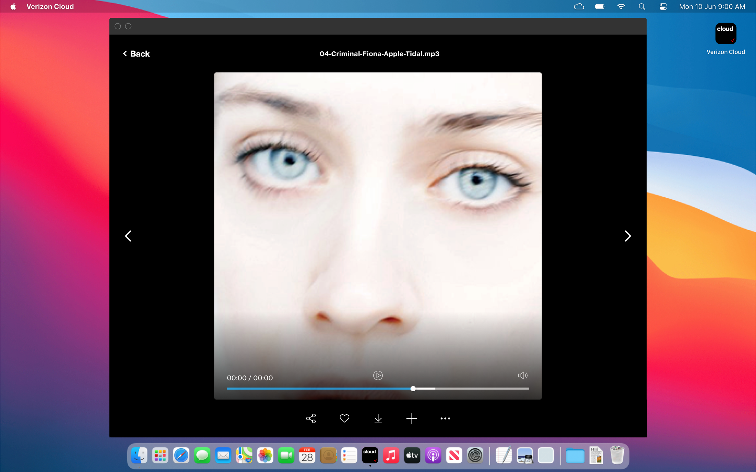
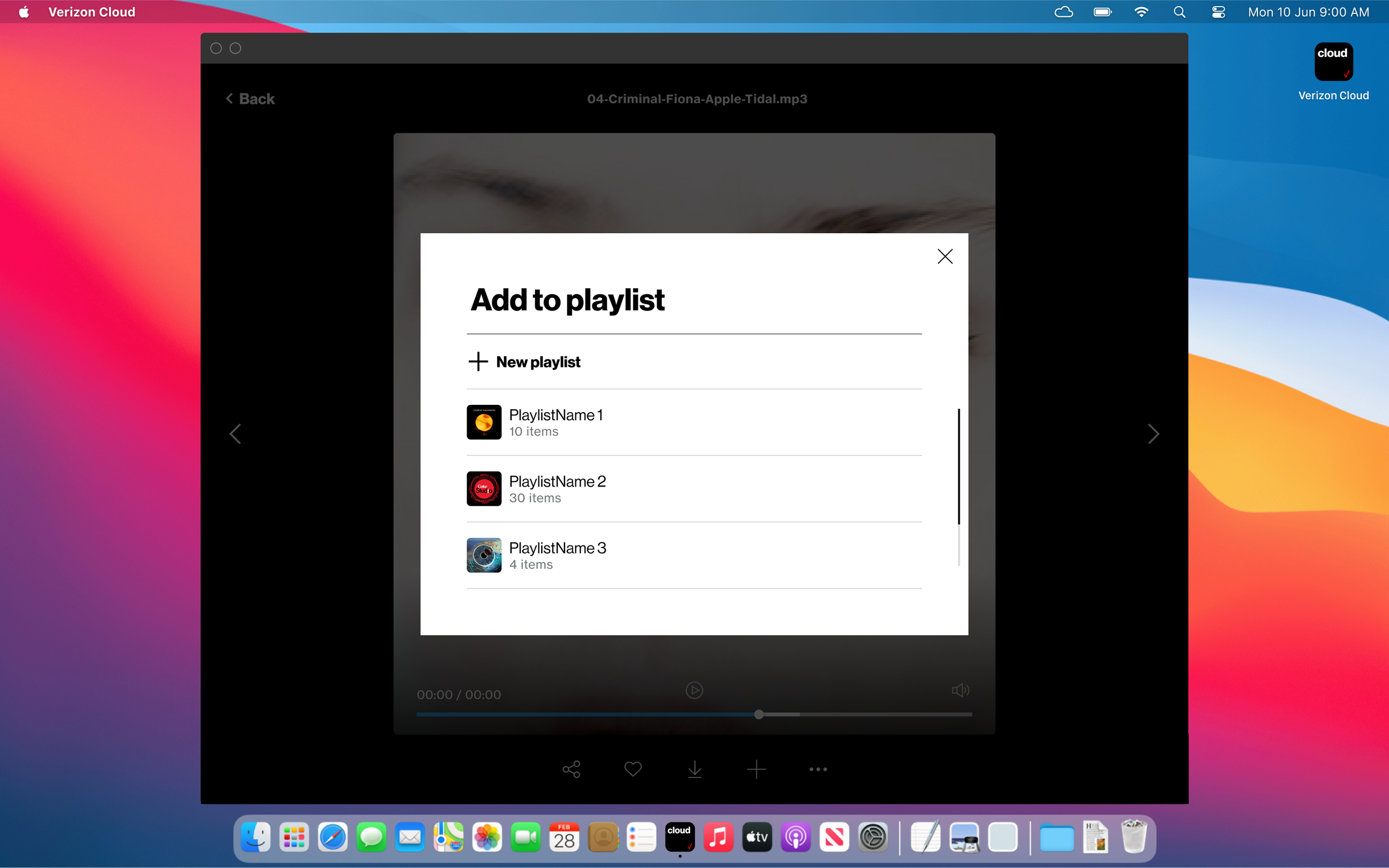
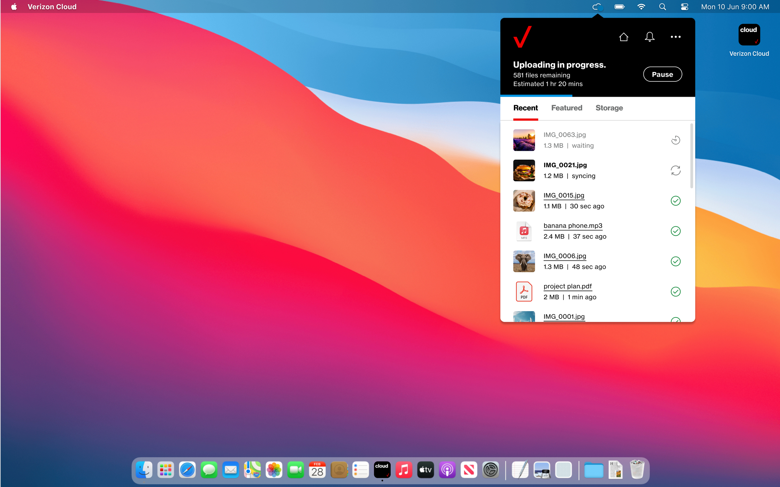
The team replaced the legacy design with a componentized structure that improved navigation and gave key features more room, while rebuilding the underlying architecture to scale more efficiently across platforms. The result was a unified, cross-platform experience built on a more flexible foundation.
Results and Impact
Upload speeds improved, system errors decreased, and sync issues dropped significantly.
App store ratings climbed on both iOS and Android.
Annual revenue roughly doubled over the course of the multi-year initiative, with the product reaching more than 10 million customers.
Reflection
Working this closely with a product lead on a project of this scale taught me how much UX work is really about translation — turning an architecture decision or a business goal into something a user actually experiences as simpler. The componentized approach we landed on gave the design room to keep evolving long after launch, which is exactly what a "memory bank" product like Cloud needed.